Geocoding crowded workout classes
In 2019, K-Optional Software partnered with a real estate analytics company in Asia. This firm had aggregated a nice dataset of property listings in their market, and hoped to build something similar to one of Zillow’s features: a map interface for browsing properties with filters for price, area, neighborhood etc.
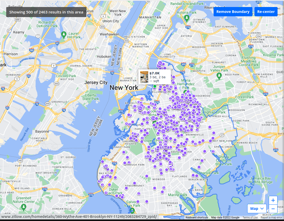
This company asked K-Optional if we could solve an annoying interface quirk- dense property markers would appear on top of each other when users zoomed in (we called it “over-clustering”). In addition to confusing people who didn’t know what to click on, these dense clusters also degraded performance since they forced the map to render many markers.

Zillow is not above over-clustering.
The requested solution would present a single big marker in place of a dense cluster of markers. A number in the big cluster indicated how many listings collapsed into it. Clicking on the big cluster would zoom in enough so that all the individual listings had space to be distinguished.
Implementing such a solution turned out to be non-trivial. Imagine looping through a large set of coordinates and trying to determine whether each was “too close” to any of its neighbors, and if it was, what the logical center of that group was. We could have run Unsupervised Nearest Neighbors to generate clusters, but executing a nonlinear algorithm every zoom or pan seemed infeasible.
A family member provided inspiration for the solution.
My partner’s dad, Mike McDonald, complained about the layout of his favorite workout, BODYPUMP™, an instructor-led weightlifting class. There, gym-goers find a spot facing the teacher in ad-hoc fashion and often end up poorly distributed. Clumping exercisers can mean a sub-optimal workout experience; everyone needs enough space for a barbell, mat, dumbbells, and a full range of motions.
He suggests that the gym should put two sets of stickers on the floor: sparse green stickers could indicate where to set-up in emptier classes and dense blue stickers could indicate stations in crowded classes. Both colors would be evenly distributed.
That logic applied perfectly to the map problem. By putting “stickers” around the globe that correspond with varying levels of zoom, we were able assign clusters in a single iteration. And fortuitously, solutions for “placing stickers” exist- Uber’s h3 library generates hexagonal segments of the entire globe with varying sizes. Implementing this approach took merely an afternoon and achieved all requirements perfectly.
Tools we’re watching
- Tailwind CSS v3.2 and container queries
- Turbopack and Next 13, and bench-marking debates.
- VHS for generating CLI gifs.